Here is an example for plotting of numerical data which are generated by numerical calculations. To do it, the calculated results should be stored in a data-file that is a usual text file. The following programs calculate a Pade approximation of y=exp(-x)
#include <stdio.h> #include <math.h> int main(void); int main(void) { int i; double x,y,z1,z2,d; d = 0.1; x = 0.0; for(i=0;i<50;i++){ x += d; y = exp(-x); z1 = (6 - 2*x)/(6 + 4*x + x*x); z2 = (6 - 4*x + x*x)/(6 + 2*x); printf("% 6.2f % 11.4e % 11.4e % 11.4en", x,y,z1,z2); } return 0; }
INTEGER I REAL*8 X,Y,Z1,Z2,D D = 0.1 X = 0.0 DO 10 I=1,50 X = X+D; Y = EXP(-X) Z1 = (6 - 2*X)/(6 + 4*X + X*X) Z2 = (6 - 4*X + X*X)/(6 + 2*X) WRITE(6,20) X,Y,Z1,Z2 10 CONTINUE 20 FORMAT(F6.2,3(1X,1PE11.4)) STOP END
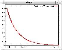
Those programs give the following output. The first column is X-coordinate, the second is a direct calculation of EXP(-X), the third and forth columns are the Pade approximation with different orders. As you can see, this approximation is only valid for small X values.
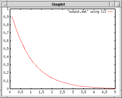
Data file “output.dat” contains the calculated values above. Each X-value has 3 different Y values in this case. To draw the second column (calculated EXP(-X) values) as a function of the first column, use using keyword at plotting.
gnuplot> plot "output.dat" using 1:2 with lines
A style of graph is specified by the with keyword. In the example above, lines style is given, with which each data point is connected by small lines. There are several kinds of line-styles those are numbered by 1, 2, 3… To change the line style, with lines is followed by the line-style number. If the number is not given, gnuplot assigns numbers automatically from 1 to a certain maximal number.
There are several plot-styles — draw symbols, connect with lines, connect with step-like lines, draw bars, etc.
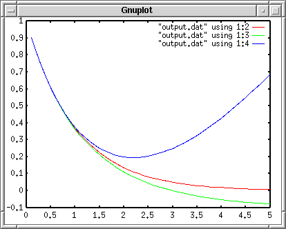
Next, the third and fourth columns are plotted on the same figure. To draw several lines simultaneously, repeat the data specification like — plot "A" using 1:2 with line, "B" using 1:2 with points, ... Sometimes such a command line becomes very long. If a line is ended with a character ”, the next line is regarded as a continuous line. Don’t put any letters after the back-slash.
gnuplot> plot "output.dat" using 1:2 with lines, > "output.dat" using 1:3 with lines, > "output.dat" using 1:4 with lines
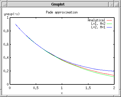
The second line shown by green color is negative at the large X values, so that the Y-axis scale was enlarged to -0.1
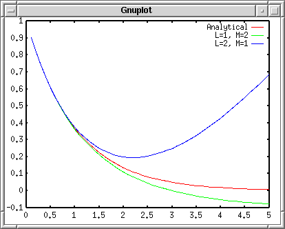
In the figure legend, the data-file name and the column numbers those were used for plotting were indicated. The red line is obtained by an analytical function, so let’s change the first line of the legend into “Analytical”. The next green line is a result of Pade approximation with L=1 and M=2, so that “L=1, M=2” should be displayed. The blue line is also the result of “L=2, M=2” Pade approximation.
gnuplot> plot "output.dat" using 1:2 title "Analytical" with lines, > "output.dat" using 1:3 title "L=1, M=2" with lines, > "output.dat" using 1:4 title "L=2, M=1" with lines
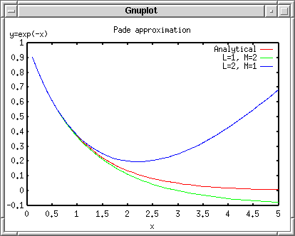
Now, let’s insert X and Y axis names. The name of X axis is just “x”, while the Y axis is “y=exp(-x)”. To set those names, use the set xlabel and set ylabel commands. In addition, you can put a title of this figure, “Pade approximation”, by the set title command. With the replot command, you can omit a long plot command.
gnuplot> set xlabel "x" gnuplot> set ylabel "y=exp(-x)" gnuplot> set title "Pade approximation" gnuplot> replot
The figure size is changed when the title and axis names are given. Gnuplot calculates the figure size automatically so as to fit everything in a screen, then the graph itself becomes smaller when the axis names or figure title are given.
The Y axis name “y=exp(-x)” does not go to the left side of the Y-axis, but it is displayed at the top. This is because gnuplot cannot rotate a text when the X Window system is used. With the Postscript terminal you can get a rotated Y-axis name which locates at an appropriate position. If your gnuplot is newer than ver.3.8, the Y-axis name should be rotated on your screen too.
The graduations on the X-axis starts with 0, and the interval is 0.5. To change the graduations (tics), use set {x|y}tics . The tics can be controlled by three optional numbers. If there is a one number after the set tics command, like set xtics 10 , this number “10” is regarded as an increment. If there are two figures, the first one is the initial value, and the second is the increment. If three, the last one becomes the final value.
You can also divide the interval which is given as an increment by the set tics command, and draw small tics inside the interval with the set m{x|y}tics n command, where n is the number of division.
gnuplot> set xtics 1 gnuplot> set mxtics 5 gnuplot> set ytics 0.5 gnuplot> set mytics 5 gnuplot> replot
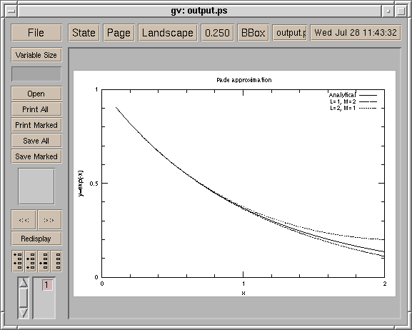
Then we make the graph in a Postscript format, and print it out. Firstly change the terminal into “postscript”, and specify a name of output file. Before quit gnuplot, save your parameters and other setup into a file ( output.plt )
gnuplot> set term postscript gnuplot> set output "output.ps" gnuplot> replot gnuplot> save "output.plt" gnuplot> quit
The file ‘output.ps’ can be browse with a Postscript viewer like ‘gv’ or ‘ghostview’, and you can print this file with a Postscript printer. The following image is our Postscript data ‘output.ps’ displayed with ghostview.
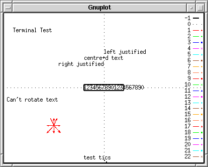
When you plotted the graph on your screen, the first line was a red line. However it turned into the solid line here. The blue and green lines became the dashed lines. (Though it is hard to see them in a small size image.) As you can see above, line and symbol types depend on the terminal you use. In order to know which line number corresponds to the solid, dashed, dotted, etc. try test . For example, on the X window system, you get: